News
Imagery: A better “picture” of the city

As part of our series of thought leadership pieces from chief data practitioners on the current state of city data, Daniel Arribas-Bel – Senior Lecturer in Geographic Data Science at the Department of Geography and Planning, director of the MSc in Geographic Data Science programme as part of the Geographic Data Science Lab at the University of Liverpool, and a member of the development team behind open source library PySAL for spatial analysis in Python – takes a look at an area in urban data that has not received as much attention as it deserves; imagery.
When trying to understand something as complex as the city, every bit of data helps create a better picture. Researchers, practitioners and policymakers gather as much information as they can to represent every aspect of their city – from noise levels captured by open-source sensors and the study of social isolation using tweets to where the latest hipster coffee shop has opened – exploration and creativity seem to have no limits. This is where traditional Urban Data is used.
But what about imagery?
You might well ask, what type of images? How do you analyse them? What’s the point anyway?
Let’s start with the why. Images contain visual cues that encode a host of socio-economic information. Imagine a picture of a street with potholes outside a derelict house next to a burnt out car. It may be easy to make some fairly sweeping assumptions about the average income of its resident population. Or the image of a street with a trendy barber-shop next door to a coffee-shop with bare concrete feature walls on one side, and an independent record shop on the other. Again, it may be possible to describe the character of this area.
These are just some of the many kinds of signals embedded in image data. In fact, there is entire literature in geography and sociology that document these associations (see, for example, Cityscapes by Daniel Aaron Silver and Terry Nichols Clark for a sociology approach and The Predictive Postcode by Richard Webber and Roger Burrows for a geography perspective). Imagine if we could figure out ways to condense such information into formal descriptors of cities that help us measure aspects that traditional datasets can’t, or to update them more frequently than standard sources currently allow
Qualitative over quantitative
So, on to how we should analyse these sources. Imagery is a prime example of what is called unstructured data. Images contain a lot of information, but it is not recorded in a structured way that permit direct analysis. In other words, it is not like a spreadsheet with a column for every indicator you need. Instead, it is all condensed in patterns and textures of colours arranged in particular ways across every pixel constituting the image.
This is a significant reason why, until very recently, social scientists and urban researchers have not made extensive use of images, except in cases where the limited size of datasets allowed for manual, human-based analysis. But this is all changing very rapidly thanks to advances in computer vision and artificial intelligence. Modern algorithms distributed in open-source software, paired with cheap computational resources such as graphics cards like those used in gaming computers, are enabling relatively non-technical audiences (for example, non-computer science folks like myself) to tap into state-of-the-art image analysis that tech giants like Google or Facebook use in their own products. This is opening the door to a largely unexplored field of research and practice in the urban context.
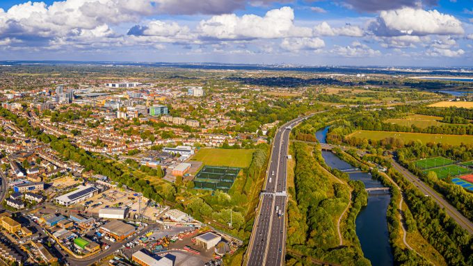
And finally, what types of image are we talking about? Generally, there are two key groups of images used in urban applications; remotely captured imagery (satellites, drones, or planes taking high-definition photos) and street-level pictures (taken by people on their smartphones, or systematically collected by systems like Google Street View).
Let’s consider some examples of each.
1. An eye in the sky…
The satellite industry is currently undergoing something of a revolution. Better, more frequent, and more detailed satellite imagery is becoming increasingly available. For example, we can now obtain free, 10m resolution images every two weeks, access images where each pixel is smaller than a chair, or image the entire planet every single day. These changes are enabling applications in the urban realm that just a few years ago would have been considered science-fiction.
As an example of what is possible with these data, together with colleagues Juan Carlos Duque and Jorge Patino, from the RISE group, we published a paper that demonstrated how combining satellite imagery with machine learning alone allows you to predict aspects of deprivation with significant precision. More recently, in work with Mel Green from the Geographic Data Science Lab and Isabel Sargent from Ordnance Survey, we are exploring the application of neural networks to aerial imagery to automatically infer the type of population that lives in a given neighbourhood – hopefully the findings from which will be published very soon.
2. …and eyes on the street
Coming back down to street-level, it is not only the visual information that is valuable, but also when and where a photo was taken. This information can also tell us interesting things about how people interact with the built environment and urban fabric. For example, colleague and researcher Meixu Chen led a project where we used the spatial and temporal signatures of photographs uploaded to Flickr to delineate areas of interest in London.
But most of the interesting stuff is happening in decoding the visual cues embedded in pixels. How we identify useful information in an image varies and results in different outputs. For example, together with my colleague Francisco Rowe, and Phil Stubbings and Joe Peskett, from the ONS Data Science Campus, we used Google Street View imagery to identify vegetation in Cardiff and intelligently aggregate it, creating area-based indicators of vegetation exposure at the street level (you can read the open-access paper here). These indices are hard and costly to create manually, hence there aren’t many available. But they can be very useful in policymaking because of the scientific evidence linking urban exposure to vegetation and green space with positive (mental) health and environmental outcomes. In, as yet, unpublished research, Meixu Chen is exploring object detection techniques to discern what makes those areas of interest described above ‘interesting’; and Sam Comber, another researcher from the Geographic Data Science Lab, is exploring cutting edge methods that allow automatic grouping of ‘similar’ images, to see if they also have similar socio-economic characteristics. As before – stay tuned for published results coming very soon.
A bright future
All of which is just an early taste of what is still to come in the space of imagery and cities. And while most of the examples here relate to my own research, I am by no means the only urban researcher excited about imagery. A growing, truly interdisciplinary community is pushing the boundaries of the possible every day. This is just the beginning – images are becoming available in larger volume, higher quality, and lower cost all the time.
Given the social relevance of visual media (think, for example, of the rise of Instagram, Snapchat, etc. and the focus that smartphone makers place on the quality of the cameras fitted in their devices), we can expect much more data being made available over the coming years. What to do with it to help us better understand cities and the activities that take place within them is still to be defined. A new frontier of discovery, and a thrilling place to be.
Our guest blog posts are intended as a platform for open debate. Views expressed are not necessarily those of Connected Places Catapult.